Mobile SEO Guide for Beginners: 9 Easy Steps for Mobile-First Indexing
Mobile SEO decides how Google crawls, indexes, and ranks your pages now that mobile-first indexing is complete. This guide explains the difference between mobile and desktop SEO, compares responsive design with separate mobile sites, and walks you through nine practical steps with official Google sources.


Mobile SEO is the work of making your website easy for Google to crawl, index, and rank on smartphones, and easy for people to use on small screens. Google now builds its index from the mobile version of each page. That makes your mobile page the version that counts, so this guide gives you nine steps to get it ready.
What Is Mobile SEO and How Does It Work?
Mobile SEO is the practice of optimizing a website so smartphones can load it quickly and search engines can crawl, index, and rank it. It works by aligning three things: the content Google reads on the mobile page, the technical setup that delivers it, and the usability people feel on a small screen.
Google’s documentation says it uses the mobile version of a site’s content, crawled with its smartphone agent, for indexing and ranking (Google Search Central). Every step in this guide follows from that single rule.
What Is the Meaning of SEO for Mobile Devices?
SEO for mobile devices means improving a site so search engines can read it and smartphone users can use it. It covers content, code, speed, and design. The goal is simple: when someone searches on a phone, your page loads fast, shows complete information, and is easy to tap and read.
What Is Mobile Optimization?
Mobile optimization is the design and technical work that makes a website load quickly and display properly on phones. It includes responsive layouts, readable text, tappable buttons, compressed images, and stable page elements. It is broader than search, because it also improves how people browse, read, and buy on small screens.
What Is Mobile Search?
Mobile search is any search a person runs on a smartphone, whether in a browser, a search app, or through a voice assistant. Short queries typed with one thumb need clear, fast answers. That is why concise page openings, quick loading, and easy navigation matter so much for phone visitors.
How Do the Main Entities Connect?
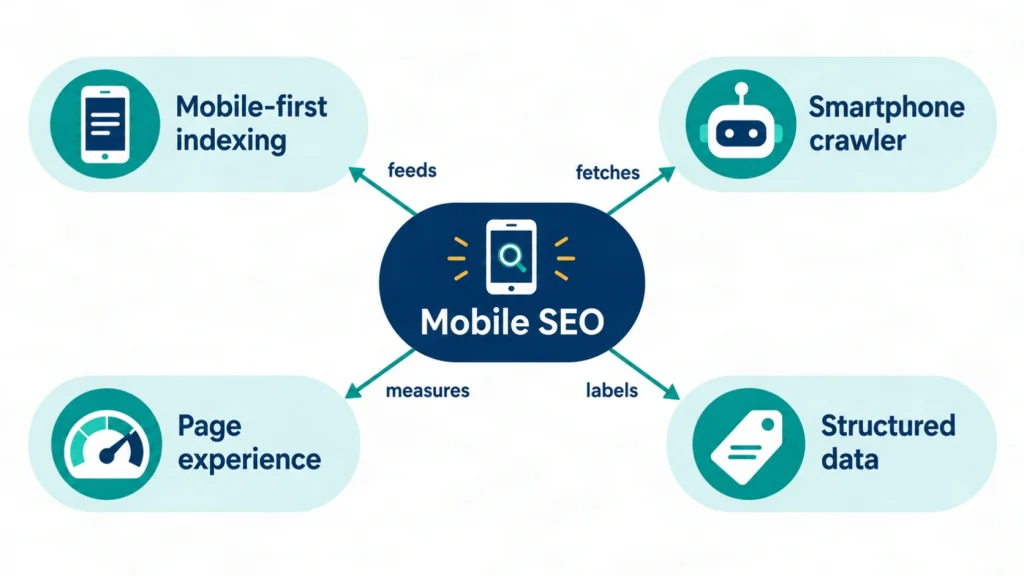
Five entities shape this topic: mobile SEO, mobile-first indexing, Google’s smartphone crawler, page experience, and structured data. Mobile SEO is the goal, mobile-first indexing is how Google collects pages, the crawler fetches the mobile page, page experience measures usability, and structured data labels the content.
This entity-first view comes from semantic SEO, where each concept gets one clear name and one clear description.
| Entity | Canonical description |
|---|---|
| Mobile SEO | Optimizing a site to be crawled, indexed, ranked, and used on smartphones |
| Mobile-first indexing | Google’s use of the mobile version of a page for indexing and ranking |
| Google’s smartphone crawler | The crawler that fetches the mobile version of your pages |
| Page experience | How fast, stable, and easy a page feels to real visitors |
| Structured data | Markup that labels page content for search engines |
What Is Mobile-First Indexing?
Mobile-first indexing means Google uses the mobile version of a site’s content, crawled with its smartphone agent, for indexing and ranking. The desktop version is no longer the main source. Google’s own guidance treats this as the default way Search collects pages. Every site is judged by its mobile page first.
Why Does Mobile-First Indexing Matter for Rankings?
It matters because anything missing from your mobile page may be missing from Google’s index. Google’s documentation is direct about the stakes. A rich desktop page with a thin mobile version can lose the keywords and details that desktop visitors still see.
“Only the content shown on the mobile site is used for indexing.”
Source: Google Search Central, Mobile site and mobile-first indexing best practices, last updated December 10, 2025.
When Did Mobile-First Indexing Start and Finish?
Google started mobile-first crawling and indexing in 2016. It declared the move complete on October 31, 2023. Its 2023 post says Search began focusing on mobile devices in 2015 with the mobile-friendly update. An Ahrefs timeline reports that over 70 percent of crawled sites had moved by March 2020.
“…the trek to Mobile First Indexing is now complete.”
Source: Google Search Central Blog, October 31, 2023.
Does Mobile-First Indexing Mean a Mobile-Only Index?
No. Google keeps one index, and mobile-first only changes which version of a page feeds it. Desktop users still see desktop pages in results. What changes is that Google reads the mobile version to decide what the page contains and which searches it can match, as the Ahrefs guide above also notes.
Is Mobile-First Indexing the Same as Mobile-Friendliness?
No. Mobile-first indexing is about which version of your content Google reads, while mobile-friendliness is about how easy the page is to use on a phone. A page can hold all its content yet have tiny buttons. Another can look polished but hide text, so mobile SEO needs both checks.
Does SEO Work on Mobile Devices?
Yes. Mobile SEO works because search engines rank pages for phone users with the same core signals as for others, such as relevance, content quality, and page experience. Google reads the mobile version first, so this work directly shapes visibility. Weak mobile pages can lose ground, while strong ones can compete in every result type.
How Do Mobile Devices Impact Search Rankings?
Mobile SEO affects rankings mainly through indexing and page experience. Google indexes the mobile page, so its content and metadata define what can rank. Core Web Vitals and usability shape how visitors experience that page. Ranking uses many signals, so no single mobile fix guarantees a position.
How Big Is Mobile Traffic Today?
Mobile devices carry about half of worldwide web traffic. StatCounter Global Stats measured mobile at 52.23 percent and desktop at 47.77 percent of worldwide platform share in June 2026. The split changes monthly and by country, so check your own analytics before you set priorities.
Mobile SEO vs Desktop SEO: What Is the Difference?
Mobile SEO and desktop SEO share the same goal, but they differ in the version Google indexes, the screen limits, and the speed and usability pressure. Because Google indexes mobile first, content that exists only on desktop is easy to lose. The mobile page sets the baseline for both.
| Factor | Mobile pages | Desktop pages |
|---|---|---|
| Role in indexing | Main version Google reads | Secondary version |
| Screen space | Small, so layout and tap targets matter | Larger, with more room for navigation |
| Hidden content | Accordions and tabs are fine when content is equivalent | Usually fully visible |
| Speed pressure | High, since phones and networks vary widely | Lower on average |
| Typical mistake | Removing content to save space | Forgetting that mobile is what Google reads first |
Which Technical Differences Matter Most?
Four differences matter most in mobile SEO: the indexed version, hidden content, structured data parity, and resource loading. Google indexes the mobile version, accepts accordions and tabs for saving space, expects the same structured data on both versions, and does not load content that needs a swipe, click, or typing.
Do Mobile and Desktop Pages Rank for the Same Keywords?
They can, but only when the content matches. Google’s documentation says equivalent content on both versions lets them rank for the same keywords. When the mobile page carries less, expect some traffic loss. Google simply gathers less information than before.
Responsive Design vs Separate Mobile Site: How Do They Differ?
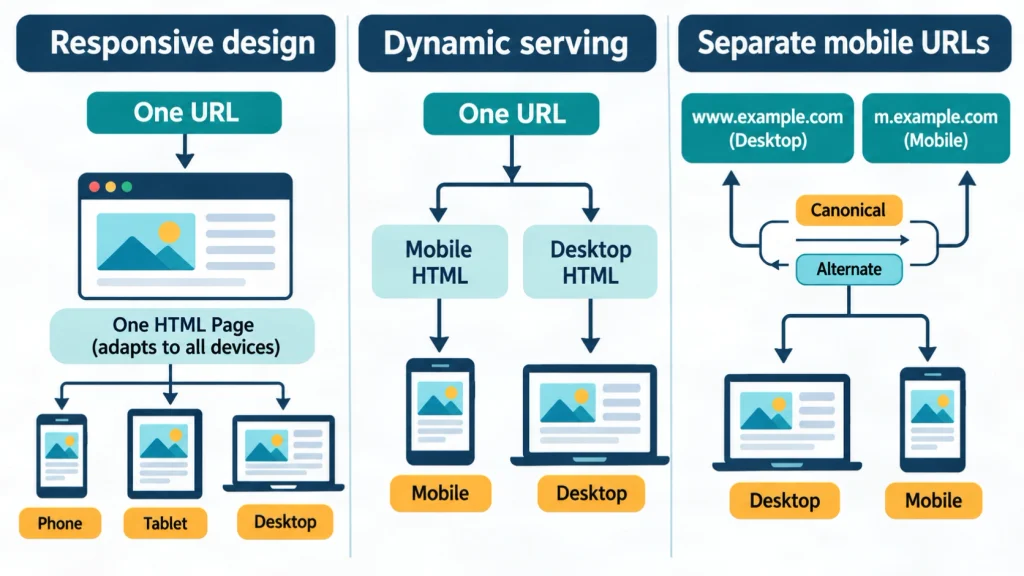
Responsive design serves one HTML page on one URL and adapts the layout to the screen, while a separate mobile site serves different HTML on different URLs. Google recommends responsive design as the easiest pattern to implement and maintain. Dynamic serving sits in the middle, with one URL and two versions of HTML.
What Is Responsive Web Design?
Responsive design serves the same HTML code on the same URL for every device and changes the display based on screen size. Content and metadata stay identical by default, so there is nothing to keep in sync. That is why it carries the lowest maintenance risk of the three setups.
What Is Dynamic Serving?
Dynamic serving uses one URL but returns different HTML for each device. It relies on user-agent detection and the Vary: user-agent HTTP header. It can fit older sites. Each template still needs matching content, metadata, and structured data, and mistakes are easy to miss because both versions share a URL.
What Are Separate Mobile URLs?
Separate mobile URLs serve different HTML on different addresses, such as an m-dot subdomain, and redirect users by device. Google asks for a canonical tag on the mobile page pointing to the desktop URL, plus an alternate link from desktop to mobile. This setup needs the most care.
A common mistake here is redirecting many desktop pages to the mobile home page. Google lists that pattern as a cause of pages going missing from the index.
Which Setup Does Google Recommend?
Google recommends responsive design. It is the easiest option to build and maintain, and it removes the risk of mismatched mobile and desktop versions. Choose another setup only when a technical limit blocks responsive design, and then follow Google’s extra rules for that pattern.
| Setup | URLs | HTML | Maintenance | Main risk |
|---|---|---|---|---|
| Responsive design | One URL | Same HTML | Lowest | Heavy pages on slow phones |
| Dynamic serving | One URL | Different HTML by device | Medium | Content or metadata mismatch |
| Separate mobile URLs | Two URLs | Different HTML | Highest | Wrong redirects, missing canonical or alternate tags |
How Do You Optimize a Site for Mobile Search in 9 Steps?
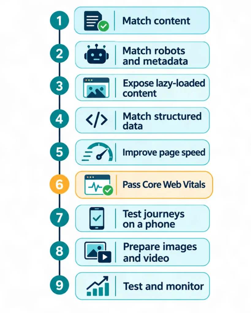
You do mobile SEO in nine steps: match content, align robots rules and metadata, expose all content, copy structured data, speed up pages, pass Core Web Vitals, test key journeys, prepare media, and monitor results. Steps 1 to 4 form a parity check. Steps 5 to 9 cover performance and upkeep.
Step 1: How Do You Match Content on Mobile and Desktop?
Mobile SEO starts with content parity. Compare the main text, headings, images, and links on both versions of every key template. Google says the mobile site should hold primary content equivalent to desktop, with the same clear headings. When space is tight, move content into accordions or tabs instead of deleting it.
Step 2: How Do You Keep Robots Rules and Metadata the Same?
Use the same robots meta tags, robots.txt rules, titles, and meta descriptions on both versions. Google warns that a noindex or nofollow tag on the mobile page can stop crawling and indexing under mobile-first indexing. Equal titles and descriptions also prevent missing-metadata errors.
Step 3: How Do You Stop Lazy-Loading From Hiding Content?
Load primary content without requiring a swipe, click, or typing, because Google does not perform those actions. A useful rule: content inside an accordion is fine when it sits in the page on load, while content that appears only after a tap is not. Test with Google’s lazy-loading guidance and the URL Inspection tool.
Step 4: How Do You Match Structured Data on Both Versions?
Copy the same structured data to the mobile version and use mobile URLs wherever the markup lists URLs. Google names missing mobile structured data as a common cause of ranking drops after the switch. Where you must prioritize, start with Breadcrumb, Product, and VideoObject markup.
Step 5: How Do You Improve Mobile Page Speed?
Good mobile SEO cuts what the phone must download and run: compress images, trim unused CSS and JavaScript, and use caching. Measure with PageSpeed Insights and fix the template used by most landing pages first. Faster pages also support the Core Web Vitals targets in the next step.
Step 6: How Do You Pass Core Web Vitals on Mobile?
Core Web Vitals pass when the 75th percentile of real visits meets three targets. Largest Contentful Paint must be 2.5 seconds or less. Interaction to Next Paint must be 200 milliseconds or less. Cumulative Layout Shift must be 0.1 or less. These thresholds come from Google’s web.dev guidance, so recheck them there before each audit.
Step 7: How Do You Test Navigation, Forms, and Calls to Action on a Phone?
Complete your main journeys on a real phone: open the menu, read a page, fill a form, and tap a call button. Note every step that feels slow or awkward. Fix problems at the template level, because one weak form or menu usually repeats across many pages.
Step 8: How Do You Prepare Images and Video for Mobile?
Use high-quality images in supported formats with stable URLs, and keep the same alt text on both versions. Google also asks that videos use supported HTML tags and sit where users can find them without long scrolling on a phone. Avoid image URLs that change on every page load.
Step 9: How Do You Test and Monitor After Changes?
Test with the URL Inspection tool, PageSpeed Insights, and real devices, then monitor indexing, Core Web Vitals, and clicks in Search Console. For separate URLs, verify both versions in Search Console, because Google warns of a data shift during the switch. Review results monthly after major changes.
What Is the Best Way to Run a Mobile Friendly Test Now?
Use the URL Inspection tool, PageSpeed Insights, and your browser’s device mode, because Google retired its Mobile-Friendly Test and Mobile Usability report on December 1, 2023. Add checks on two or three real phones, since emulators miss real touch and network behavior.
What Happened to Google’s Mobile-Friendly Test?
Google retired the Mobile-Friendly Test, its API, and the Mobile Usability report in Search Console on December 1, 2023. Google’s 2016 announcement page now carries that note, and Search Engine Land reported the shutdown. Older guides that still send you to the tool are outdated.
How Do You Run a Simple Mobile Audit?
Pick your five most important landing pages for a mobile SEO audit, load each on a real phone, and score them against the nine steps above. Record content gaps, speed numbers, and usability problems in one sheet. Repeat after each release. This is a documented method, not a test result from a client project.
What Are the Most Common Mobile Usability Issues?
The most common mobile SEO problems are small text, cramped tap targets, intrusive pop-ups, heavy ads, and blocked resources. Each one makes a page harder to use or harder for Google to render, and each is easy to catch on a real phone.
How Do Text Size and Tap Targets Affect Users?
Small text forces pinching, and buttons placed too close together cause mis-taps. Ahrefs lists text size, tap targets, and padding among the usability checks to review. Use readable body text, clear spacing between links, and large buttons for key actions such as calling or booking.
Why Are Pop-Ups and Ads a Problem on Phones?
Full-screen pop-ups and large ads cover the content people came to read. Google’s documentation asks sites to follow the Better Ads Standard and notes that ads at the top can take too much room on a phone. Google also publishes separate guidance on interstitials. Keep overlays small and easy to close.
Can Blocked Resources Break Mobile Rendering?
Yes. Google lists blocked images, blocked mobile URLs, and noindex tags among the errors that can remove pages from the index after the switch. Check the robots.txt rules for both versions and confirm that important images, scripts, and styles can be crawled.
How Does Mobile Optimization Apply to Local Businesses and Apps?
Local businesses gain from mobile SEO when their pages load fast and show address, hours, and contact details clearly, while apps need web pages that Google can index. Both rely on the same basics: complete content, fast pages, and consistent information across the website and business profiles.
How Does SEO for Mobile Help Local Businesses?
A local searcher on a phone wants quick answers such as an address, opening hours, and a way to call. Mobile SEO supports that need through a page with clear service details, a tap-to-call button, and a consistent address. Pair it with local SEO work and Google Business Profile optimization.
How Do You Do SEO for a Mobile App?
App SEO has two parts: making the app’s information discoverable through indexable web pages, and improving the app store listing, which is a separate system from Google Search. Google has published guidance on app deep links that connect a website and an app, so review it before you build.
How Much Does SEO Cost for a Small Business?
Mobile SEO pricing depends on site size, competition, content needs, and technical work, so there is no single fair monthly figure. Retainers, one-time audits, and project fees all exist. This guide quotes no price because it used no verified, current benchmark. Ask any provider for a written scope instead.
What Affects the Cost of SEO Services?
Five factors drive price: the number of pages, the competition for your keywords, the state of your technical setup, how much new content you need, and how much reporting you want. A small site with one technical fix costs less than a large store with weak content.
Is an SEO Service Worth It?
An SEO service is worth it when the work targets a clear gap and is measured against agreed goals, such as indexed pages, qualified clicks, and leads. No provider can guarantee rankings. Compare scopes, ask for sample reports, and review options such as website SEO services in Oman when your business operates there.
What Risks and Limits Should You Know Before Making Changes?
The main risk in mobile SEO is losing indexed content or traffic when you change templates, redirects, or robots rules. This guide cannot promise rankings, traffic, or AI citations, and it does not replace a developer who can see your site. Test every change on a staging copy and keep a backup.
What Are the Limits of This Guide?
This guide to mobile SEO relies on Google documentation, Google’s blog, and the public data sources linked in the text. It does not report a private client test or an original experiment. Search Console data for your own site is the best evidence of what to fix. StatCounter figures describe averages, not your audience. It offers technical publishing guidance only, not legal or financial advice.
Who Is the Author and When Was This Guide Last Checked?
Forkan Mahmud is an SEO professional working from Oman, with about five years of experience in local SEO, Google Business Profile optimization, topical maps, content briefs, and on-page optimization for clients that include European businesses. The facts above were last checked against the linked sources on November 6, 2026, and the next review is due between February and May 2027. Questions can go through the contact page.
Conclusion
Mobile SEO comes down to one rule: give Google’s smartphone crawler the complete, fast, and usable version of every page. Use responsive design where you can, run the nine steps, and test on real phones.
A good next step is to audit your five most important pages this week and fix the gaps you find. As you publish more guides like this one, link them together to build topical authority across your site.
Frequently Asked Questions
These ten answers cover the most common follow-up questions about mobile indexing, mobile usability, cost, and who owns the work inside a company, so you can act on this guide with confidence.
What Is Mobile Search Engine Optimization?
Mobile search engine optimization, often shortened to mobile SEO, is the practice of making a website easy for search engines to crawl and for phone users to read. It covers content parity, page speed, usability, and technical setup. The aim is complete, fast pages that match what people want when they search on a smartphone.
How Can I Check Whether My Site Uses Mobile-First Indexing?
Google says the move to mobile-first indexing is complete, so assume your site uses it. Open the URL Inspection tool in Search Console and review the crawl details for a page, which typically show the smartphone crawler. Then compare the rendered mobile content with your desktop page to confirm nothing is missing.
Can I Hide Text in Accordions on Mobile?
Yes, provided the content is equivalent and loads with the page. Google’s documentation suggests moving content into accordions or tabs to save space instead of removing it. Avoid designs where text appears only after a swipe, tap, or typing, because Google does not trigger those actions when it fetches a page.
Do I Need a Separate Mobile Site?
No. Google says a mobile version is not required for your content to appear in Search, but it very strongly recommends one. A responsive design gives phone users a proper experience without a second site to maintain. Build a separate mobile site only when a technical limit forces that choice.
Who Handles SEO in a Company?
The owner varies by company size. Small teams often give SEO to a marketing lead or an outside specialist, while larger companies split it across content, development, and analytics roles. Mobile SEO work needs developers for speed and templates, writers for content parity, and one named person who tracks Search Console results.
Does SEO Make Money?
SEO can bring qualified visitors who later call, subscribe, or buy, but it never guarantees income or rankings. Results depend on competition, offer quality, and how well pages match search intent. Track leads and sales next to clicks and impressions in Search Console and your analytics so you can judge return honestly.
Does SEO Affect Social Media?
SEO targets search engines, while social platforms run their own feeds and search tools. The two can support each other, because social posts may send visitors to your pages. This guide reviewed no evidence that sharing alone lifts Google rankings, so treat social activity as a separate channel with its own goals.
What Is the Best Mobile Search Engine?
The best choice depends on your market and audience. Google is the main target for most websites, and other engines matter in certain regions or on certain devices. Check the traffic sources in your own analytics before deciding. Steps such as matching content and improving speed help your pages work well on any engine.
What Does a Mobile Optimization Service Include?
A solid mobile SEO service usually includes a content parity audit, a technical review of robots rules and structured data, speed and Core Web Vitals fixes, usability testing on real phones, and Search Console monitoring. Ask for a written scope and a sample report. Treat any promise of guaranteed rankings as a warning sign.
How Often Should I Audit My Mobile Pages?
Audit after every major template, theme, or redirect change, and review key pages monthly. Quarterly full mobile SEO reviews suit stable sites. Because Google guidance and tool names change, as the retired Mobile-Friendly Test shows, recheck official documentation every three to six months and update your checklist when it changes.