Landing Page Design That Converts: A Practical Guide to Layout, Forms, Trust and Speed
A landing page converts when it makes one action clear, easy, and trustworthy. This guide covers the goal, page structure, headlines and calls to action, forms, trust, speed and accessibility, right-to-left and multilingual audiences, testing, and a 10-point launch checklist.

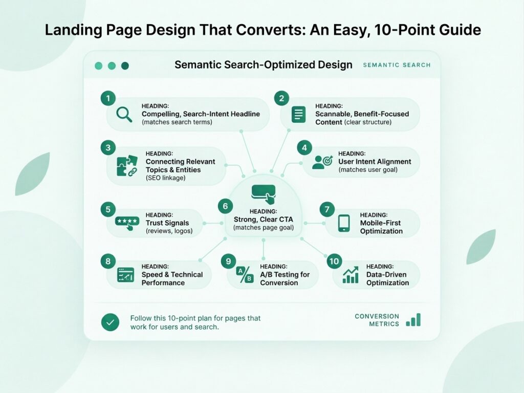
Landing page design that converts starts with a clear goal, not a good-looking template. A landing page has one job, such as getting a visitor to book a call, request a quote, or buy a product, and every design choice should help that job. This guide explains how to structure the page, write headlines and calls to action, design forms, build trust, and protect speed and accessibility. It also separates what is well documented from what is only common advice, and it covers right-to-left and multilingual audiences across the Middle East, Europe, and Asia.
Choose one conversion goal and one audience. Match the page to the message that brought the visitor, put the benefit and the call to action on the first screen, and keep forms short and clear. Build trust with proof you can verify, and keep the page fast, readable, and accessible on a phone. Measure against your own baseline, because no design guarantees a conversion rate.
When I review website structure for clients, weak landing pages usually fail before the design stage: the goal is vague, or the page tries to serve several audiences at once. The sections below start with that planning and move towards testing.
What Is a Landing Page, and What Makes Landing Page Design That Converts?
A landing page is a page built for one specific action, and its design converts when it makes that action clear, easy, and trustworthy for the right visitor.
What is a landing page, and how is it different from other pages?
A landing page is a page where visitors arrive from an advert, an email, a search result, or a link, and it is built around a single goal. A home page serves many goals and many visitors. A landing page narrows the choices.
What does “converts” mean? Define the conversion first
A conversion is the specific action you want a visitor to take, such as submitting a form, calling, or completing a purchase. Decide it before design starts, because it decides the layout, the call to action, and how you measure success.
What can design change, and what can it not change?
Design can reduce confusion, effort, and doubt, but it cannot make people want something they do not need. A weak offer, the wrong audience, or an untrusted brand will limit results whatever the design looks like. Treat design as one factor among several.
What evidence do we have? What sources do and do not prove
Most landing page advice comes from tool vendors and agencies, and I found no Google or W3C source proving that a particular design pattern raises conversion rates. Those results come from one business, one page, and one period, so they do not transfer. This guide relies on documented standards for speed and accessibility, and presents the rest as practical judgement.
How Do You Start With One Goal and One Audience?
Start by writing down one conversion goal, one audience, and the question that audience arrives with. Planning this first stops the page becoming a list of everything the business offers. A good web design service begins with these questions, before any layout work.
Choose a single conversion goal
Pick one primary action, and make every element support it. If you need a secondary action, such as a phone number, keep it visually quieter than the main one. A page with three equal calls to action asks the visitor to decide between them, which adds effort.
Match the page to the visitor’s intent and source
A visitor from a search for a price needs different content from a visitor who clicked a general brand advert. A visitor ready to act needs a clear route. A visitor still comparing needs reasons and proof first.
Message match between the ad or search result and the page
The page headline should repeat the promise the visitor clicked on, in similar words. If an advert offers “free quote in 24 hours” and the page opens with a generic company slogan, the visitor may think they are on the wrong page. This is a widely used principle rather than a documented rule, so check it against your own results.
Plan the page before opening a design tool
Write the headline, the main benefits, the proof, and the call to action in plain text before you design anything.
How Do You Structure the Page From Top to Bottom?
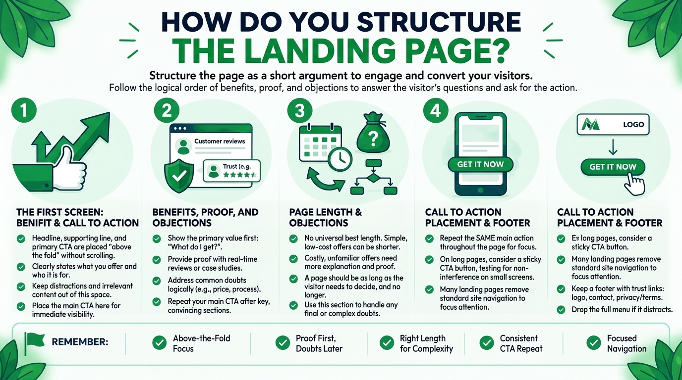
Structure the page as a short argument: state the benefit, show how it works, prove it, answer doubts, and ask for the action. For more on how page layout and site structure connect, see these web design and architecture articles.
The first screen: headline, supporting line, and main call to action
The first screen should say what you offer, who it is for, and what to do next. Put a clear headline, one supporting line, and the main call to action where visitors see them without scrolling. Keep distractions out of that space.
Benefits, proof, and objections in a logical order
After the first screen, follow the order in which a visitor’s questions arise: what do I get, can I trust it, and what if it goes wrong. Show benefits first, then proof such as reviews or examples, then answers to common doubts such as price or process.
How long should a landing page be?
A landing page should be as long as the visitor needs to decide, and no longer. There is no universal best length. A simple, low-cost offer may need a short page. A costly or unfamiliar offer usually needs more explanation and proof.
Where to place the call to action
Place the main call to action on the first screen and repeat it after the key sections. Repeating the same action is different from adding competing actions. On long pages, consider a sticky button, and test that it does not cover content on small screens.
Footer and navigation: what to keep and what to remove
Remove the main site navigation if it pulls visitors away from the goal, and keep only the links that build trust. Many landing pages drop the full menu and keep a logo, a contact option, and privacy or terms links. This is common advice rather than a rule.
How Do You Write and Design Headlines and Calls to Action?
Write headlines that state the benefit in plain words, and calls to action that say what happens next. Clear copy is part of design, and good SEO content writing uses the same rule: say it simply.
Write a headline that states the benefit clearly
A good headline tells the visitor what they get in a few plain words.“Get a fixed-price website quote in 24 hours” is clearer than “Welcome to our agency”.
Write a call to action that says what happens next
Label the button with the action and, where useful, the result, such as “Request my quote” or “Book a free call”. Generic labels like “Submit” say nothing about what follows.
Make the call to action easy to see
Give the main button enough size, contrast, and space to stand out from the rest of the page. Colour matters less than contrast against its surroundings. Check the button text against its background using the contrast rules later in this guide.
Avoid competing calls to action
Limit the page to one main action, and make other links visibly secondary. Two or three equally strong buttons make the visitor stop and choose. If you need two paths, such as “Buy now” and “Talk to us”, label them clearly and give the main one more weight.
How Do You Design Forms That People Finish?
Design forms that ask for the minimum, label every field clearly, and explain what happens to the data. Form design is the most direct way a landing page loses or keeps a visitor, so it deserves the same attention as the headline.
Ask only for what you need
Ask for the information you will actually use, and leave out the rest. Every extra field adds effort, so each one should have a reason. A name and an email address may be enough for a first contact. You can ask for more detail in the follow-up conversation. There is no fixed number of fields that works everywhere, so test your own form.
Labels, field types, and helpful error messages
Give every field a visible label, use the right input type, and write error messages that say what to fix. A label should stay visible, not disappear into placeholder text. Placeholder text also needs enough contrast, as the W3C guidance on contrast applies to it. A simple label looks like this:
<label for=”email”>Email address</label>
Use the right field type, such as type=”email” or type=”tel”, so phones show a suitable keyboard.
Explain what happens to personal data
Say briefly why you collect the information and how you will use it, and link to your privacy policy. If you collect personal data from people in Europe or the UK, data protection rules such as the GDPR may apply. This is not legal advice, so check the requirements with a qualified adviser and your regulator’s guidance.
Test the form on a phone and with a keyboard
Complete your own form on a real phone and with the keyboard alone before launch. Check that fields are large enough, the right keyboard appears, the button is reachable, and the confirmation is clear. A form that works on a desktop can fail on a small screen.
How Do You Build Trust on a Landing Page?
Build trust with proof that a visitor can check, clear business information, and honest claims. Visitors who do not know your brand look for reasons to believe you, and design can make that proof easy to find.
Testimonials, reviews, and case results used honestly
Use real testimonials with a name, a role, or a link where possible, and describe results accurately. If you quote a result, say what it was and over what period, and do not suggest that other customers will get the same. For an e-commerce business, real product reviews serve the same purpose.
Logos, credentials, and guarantees you can prove
Show client logos, certifications, awards, or guarantees only when they are real and you can document them. An unverified badge can damage trust if a visitor checks it. Keep guarantees simple and honest, and make sure the terms are easy to find.
Contact details and real business information
Show real contact details, a business name, and an address or other proof that a real business stands behind the page. Some guides tell you to remove phone numbers to avoid distraction, but for a high-trust offer, a visible contact option can help. Test it.
Avoid fake urgency and invented numbers
Do not use countdown timers that reset, invented stock levels, or made-up statistics. They are misleading, and visitors who notice them lose trust. Use only numbers you can verify, and say where they come from.
How Do Images, Colour, and Layout Support Conversion?
Use images that show the product or outcome, colour and contrast that guide the eye, and enough space for the page to be read quickly. Visual design should make the message clearer, not compete with it.
Choose images that show the product or outcome
Choose images that show the real product, service, or result, and avoid generic stock photos that say nothing. A photograph of the actual team, product, or finished work builds more trust than a stock image.
Use colour and contrast to guide the eye
Use a limited colour palette, and keep your strongest contrast for the main call to action. Pick colours that fit the brand, and test that text and buttons are readable. No colour has been shown to work best everywhere, so test instead of copying a rule.
White space and visual hierarchy
Use space, size, and alignment to show what matters most, so a visitor can scan the page in seconds. The headline should be the largest text, the call to action the most prominent control, and supporting text smaller.
Keep animation and effects light
Use animation only where it explains something, and avoid effects that slow the page or distract from the call to action. Autoplay video and heavy sliders add weight and compete for attention.
How Do Speed, Mobile Design, and Accessibility Affect Conversion?
Speed, mobile design, and accessibility affect how many visitors can use the page at all, so they belong in the design from the start. I did not find a source that proves an exact conversion gain from any of them, so treat them as usability basics. Fast pages also support website SEO when the page is meant to be found in search.
Page speed and Core Web Vitals
Aim for the Core Web Vitals “good” thresholds: Largest Contentful Paint at 2.5 seconds or less, Interaction to Next Paint at 200 milliseconds or less, and Cumulative Layout Shift at 0.1 or less. These figures come from the web.dev article on how the thresholds were defined, which says they are assessed at the 75th percentile of page views. Compress images, limit fonts and scripts, and reserve space for images so the page does not jump.
Design for the phone first
Design the small-screen version first, because many visitors will arrive on a phone. Put the headline, the main benefit, and the call to action in the first screen.
Contrast, text size, and tap targets
Meet the WCAG contrast minimum of 4.5:1 for normal text and 3:1 for large text, and make tap targets at least 24 by 24 CSS pixels. The contrast figures are in the W3C’s guidance on contrast minimum, which also applies to placeholder text. The 24-pixel target size comes from WCAG 2.2 (success criterion 2.5.8). Larger buttons are easier to tap, so treat these numbers as a floor.
Keyboard and screen reader basics
Make sure a visitor can reach every link, field, and button with a keyboard, and that each control has a clear name. Use real buttons and labelled fields, keep a visible focus outline, and write useful alt text. Test the page by tabbing through it.

How Should Landing Pages Work for Right-to-Left and Multilingual Audiences?
Build each language version as a complete page, with the right direction, translated and localised content, and the contact and payment options that market expects. Many businesses in the Middle East, Europe, and Asia serve several languages, and a layout built for English can break.
Right-to-left layouts, such as Arabic
For Arabic and other right-to-left languages, mirror the layout so the headline, form, and call to action follow the reading direction. Set the page direction in the HTML and test with real content. I recommend testing with native readers, because I have not verified every pattern against a single source.
Writing and translating for each market
Write for each market instead of translating word for word, and have a native speaker review the result. Tone, examples, and even the length of headlines can differ.
Local contact options and payment expectations
Offer the contact methods and payment options your visitors in each market actually use. These vary by country, and I have no verified data on which options work best in each place. Ask your customers or check your own enquiry data.
Privacy and consent when you collect data in Europe
If you collect personal data from visitors in Europe or the UK, check the data protection rules that apply, and keep your consent wording and privacy policy accurate. The GDPR and the UK GDPR may apply to your forms and tracking tools. This is not legal advice. Use your regulator’s official guidance, and ask a qualified adviser about your own situation.
How Do You Measure and Test a Landing Page?
Measure by setting a baseline, tracking one clear conversion event, and changing one thing at a time. Testing turns opinions about design into evidence from your own visitors.
Set a baseline before you change anything
Record the page’s current conversion rate, traffic source, and device split before making changes. Without a baseline, you cannot tell whether a change helped. Use a period long enough to include normal weekly variation.
Track the right conversion event
Track the single action that matters, such as a submitted form or a completed purchase, not just clicks or page views. A click on a button is not a conversion if the form behind it fails.
A/B testing: what it can and cannot tell you
An A/B test compares two versions of a page with similar visitors, and it only gives a reliable answer with enough visitors and a clear question. Change one element at a time, and do not stop the test early because one version looks ahead. Low-traffic pages may never collect enough data to settle small differences.
Learn from single-case results carefully
A result from another company’s test is a hypothesis to try, not a rule to follow. Case studies describe one business, one audience, and one period. Use them for ideas, then test the idea on your own page.
Which Landing Page Design Mistakes Should You Avoid?
The most common mistakes are too many goals and links, vague headlines, long forms, slow or broken mobile pages, and copying another brand’s page without testing. Each one is easy to spot with a short review.
Too many goals and too many links
A page with several goals and many links gives visitors many ways to leave. Choose one goal, and remove links that do not help it.
Vague headlines and weak calls to action
A headline that does not state the benefit, and a button that says “Submit”, leave the visitor guessing. Say what the visitor gets and what happens next.
Long forms and hidden costs
Long forms and surprise costs make visitors give up or lose trust. Ask only for what you need, and state prices, fees, and conditions where visitors can see them before they commit.
Slow pages and broken mobile layouts
A slow or broken page stops visitors before the design has a chance to work. Test on a real phone and a slower connection, and fix the heaviest images and scripts first.
Copying another brand’s page without testing
Copying a famous brand’s landing page rarely works, because your audience, offer, and level of trust are different. Use other pages for ideas and test them on your own visitors.
Landing Page Design That Converts: Checklist Before You Launch
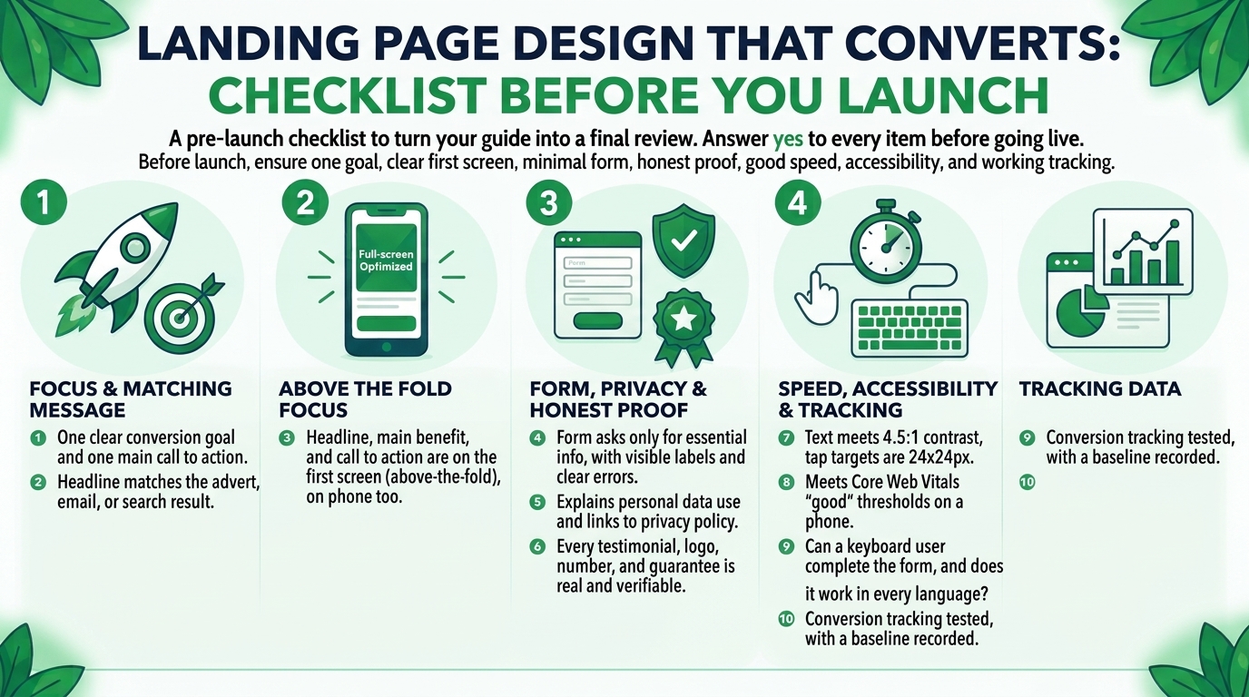
Before launch, check that the page has one goal, a clear first screen, a short form, honest proof, good speed and accessibility, and working tracking. The checklist below turns the guide into a final review.
A pre-launch checklist
Answer yes to every item below before a landing page goes live.
- Does the page have one clear conversion goal and one main call to action?
- Does the headline match the advert, email, or search result that brings visitors?
- Are the headline, the main benefit, and the call to action on the first screen, on a phone too?
- Does the form ask only for information you will use, with visible labels and clear errors?
- Does the page explain how personal data is used, and link to the privacy policy?
- Is every testimonial, logo, number, and guarantee real and verifiable?
- Does text meet 4.5:1 contrast (3:1 for large text), and are tap targets at least 24 by 24 CSS pixels?
- Does the page meet the Core Web Vitals “good” thresholds on a phone?
- Can a keyboard user complete the form, and does it work in every language version?
- Is conversion tracking tested, with a baseline recorded before launch?
How do you audit an existing landing page?
Audit an existing page by comparing it with this checklist, then reviewing speed, forms, and tracking data for the biggest problems. A regular technical SEO and audit routine can include these checks:
- Run Page Speed Insights on the page and note the slowest elements.
- Complete the form on a phone and with a keyboard, and send a test submission.
- Check that conversion tracking records a real submission.
- Compare the headline with the advert or link that sends traffic to the page.
- Review contrast, tap target sizes, and alt text on the main elements.
Fix the problems that affect the most visitors first, and change one thing at a time so you can learn from the result.
Conclusion
Landing page design that converts begins with one clear goal and a page that makes the action simple, trustworthy, and quick for the right visitor. Match the page to the message that brought the visitor, put the benefit and the call to action on the first screen, and keep the form short. Use proof you can verify, meet the speed and accessibility basics, and build each language version properly. Measure against your own baseline, and treat other companies’ results as ideas, not guarantees. Start with the pre-launch checklist, then test one change at a time.
FAQs
What is a landing page?
A landing page is a page built for one specific action, where visitors arrive from an advert, an email, a search result, or a link. It narrows the choices so the visitor can act.
What makes a landing page convert?
A landing page converts when it offers something the visitor wants, makes the next step clear, and earns trust. Design supports that with a clear layout, a short form, honest proof, and a fast, accessible page.
How long should a landing page be?
A landing page should be as long as the visitor needs to decide, and there is no universal best length. Simple offers may need a short page, and costly or unfamiliar offers usually need more explanation. Test the length with your own audience.
How many fields should a landing page form have?
Use as few fields as you need, because each extra field adds effort. There is no fixed number that works for every business. Ask only for what you will use, and test your own form.
Should a landing page have navigation?
Many landing pages remove the main menu to keep visitors focused, but it is a choice to test, not a rule. Keep the links that build trust, such as privacy and contact details.
Where should the call to action go?
Place the main call to action on the first screen, and repeat it after the key sections. Make sure the visitor never has to scroll back up to find it, and check it on a phone.
Do landing pages affect SEO?
A landing page can rank in search if it is crawlable, useful, and unique, but pages built only for adverts may not be meant to rank. Speed and mobile usability matter either way. Decide whether the page should be indexed, and set it up to match.
How fast should a landing page load?
Aim for the Core Web Vitals “good” thresholds: LCP of 2.5 seconds or less, INP of 200 milliseconds or less, and CLS of 0.1 or less. These come from web.dev and are assessed at the 75th percentile of page views.
What is a good landing page conversion rate?
There is no single good conversion rate, because it depends on the industry, the traffic source, the offer, and how you define a conversion. Most published figures come from sources I could not verify. Set a baseline for your own page, and aim to improve on it.
How do I test a landing page?
Set a baseline, track one conversion event, and test one change at a time with enough visitors. Check the page on real phones, test the form and the tracking yourself, and learn from your own data.